“Simple design.” While this sounds like a very positive thing, it is actually a rather ambiguous term. Does it mean minimal, plain, or clean? In fact, creating something simple is often more difficult than making something complex. This watch is crafted with meticulous attention to detail in its shape and specifications, pursuing simplicity with care. As a result, a refined and beautiful simple design has been achieved. Even now, long after its release, its beauty remains undiminished.
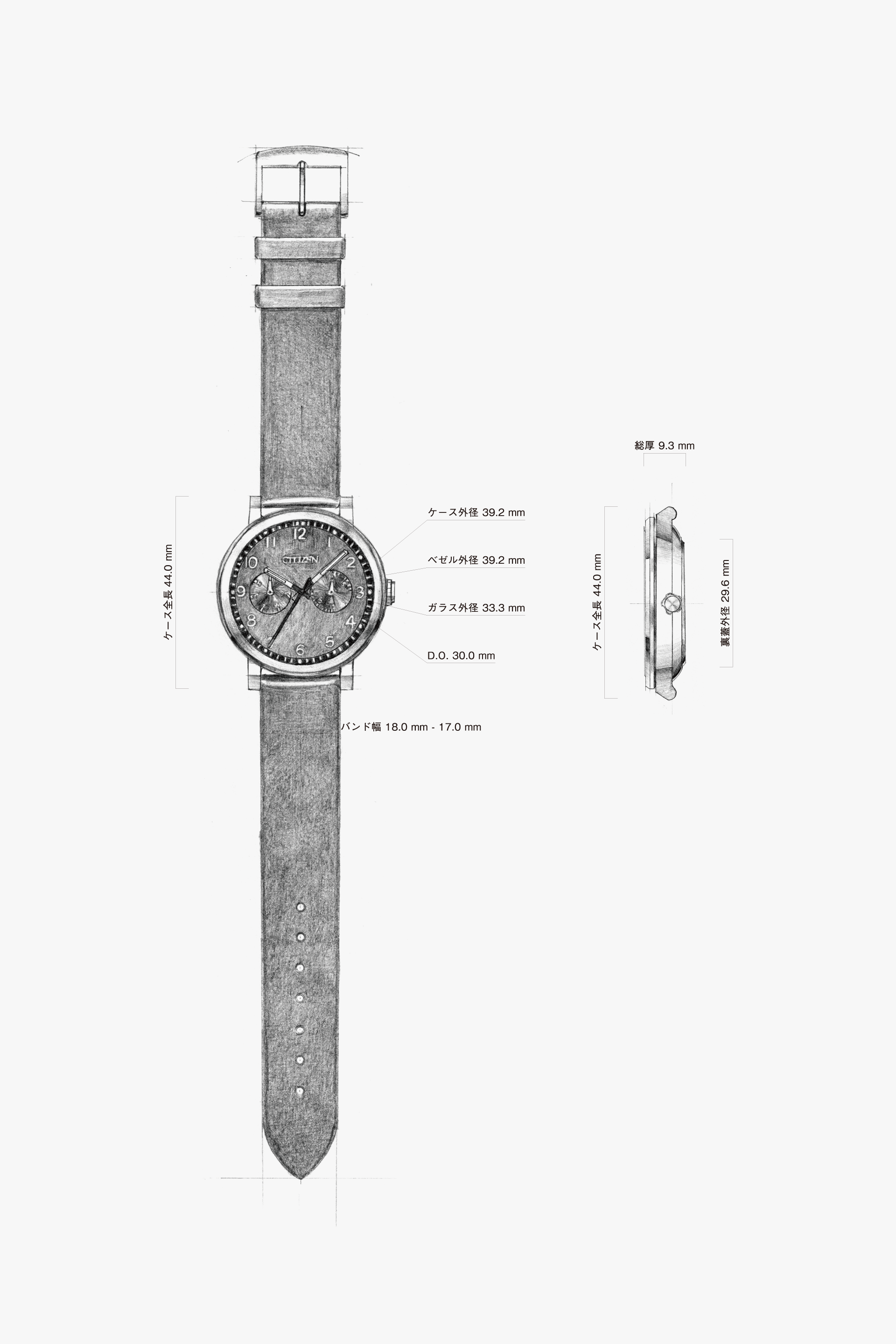
All the colors of the case, band, and dial are unified in a simple manner. However, if you look closely at the details, you’ll find many areas where the finish has been carefully considered.
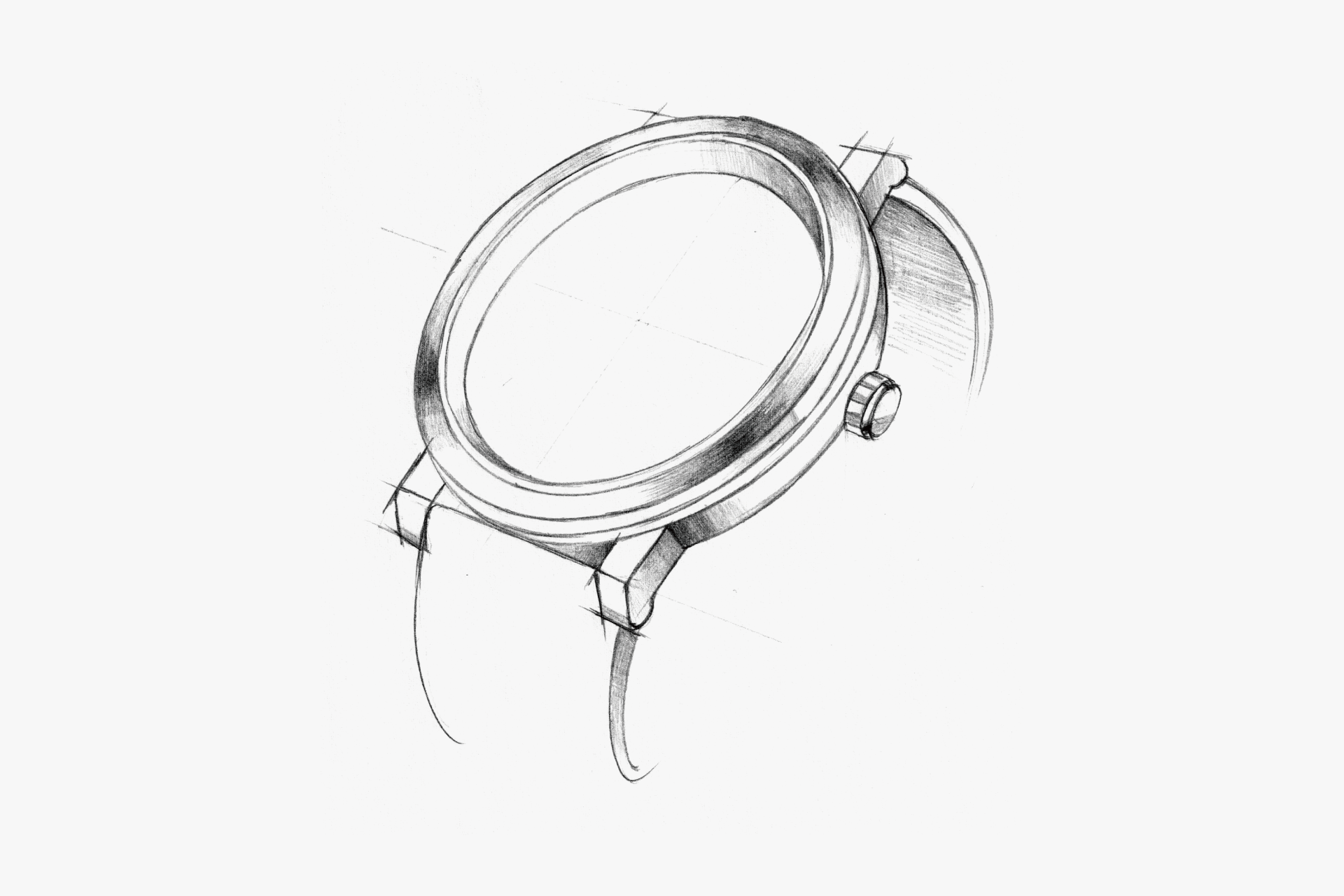
While the overall finish is mostly matte, there is a subtle polished surface on the sloped bezel that adds a gentle sparkle.
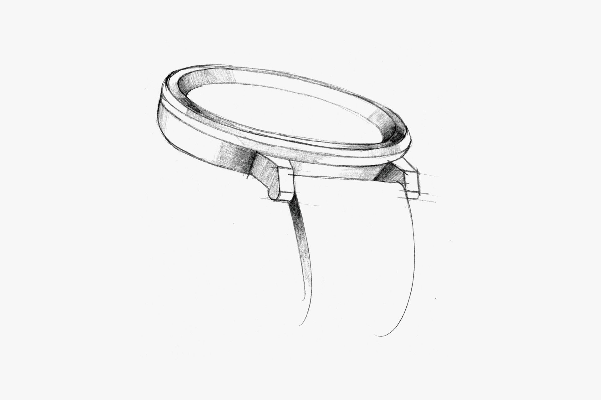
The lugs have a simple shape, with straight parallel lines on both the top and bottom surfaces.
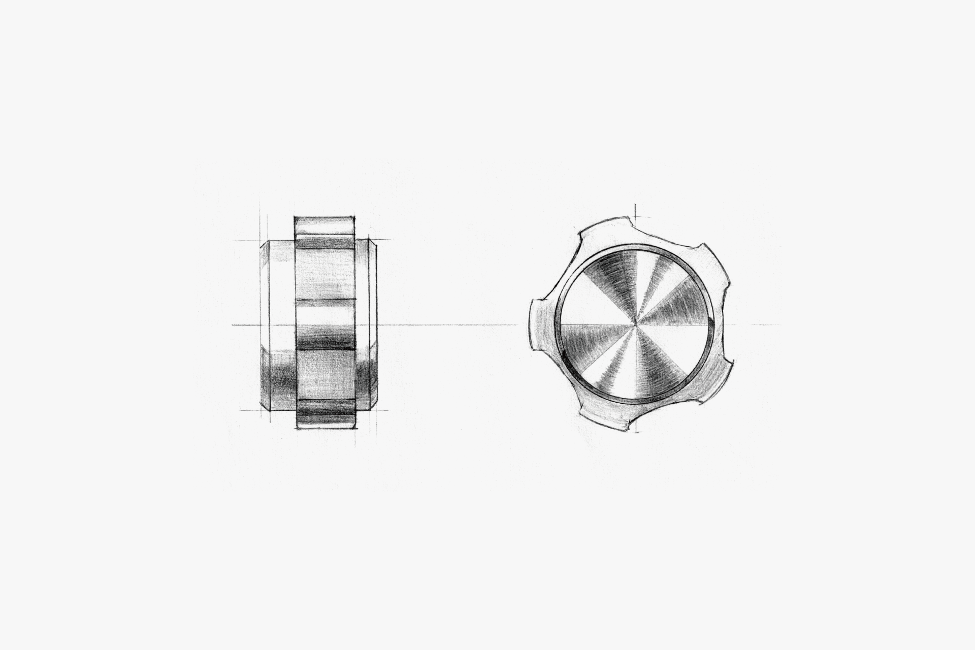
Even the small crown features meticulous finishing, such as polished and hairline surfaces, showing attention to detail.
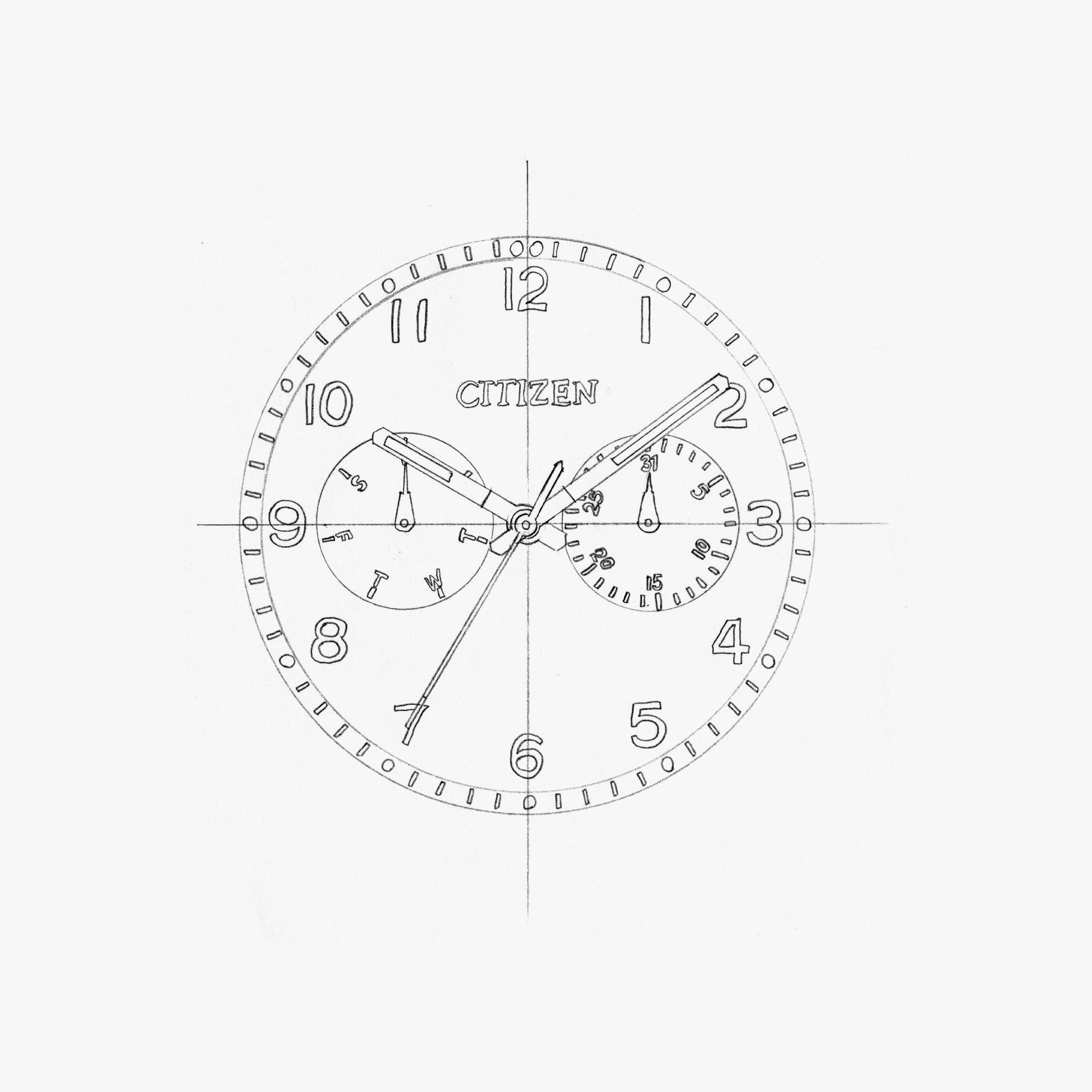
On the matte black dial, the white indexes stand out. The fine minute track and indicators are highly legible, and there is luminescence at the five-minute marks on the indicator ring.
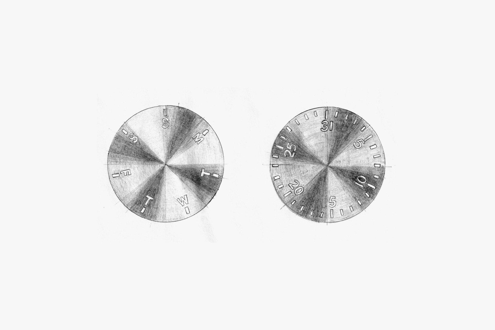
Only the minute track for S (Sunday) is in red. The sub-dial features a record-groove finish, making it the only part of the dial with a glossy appearance.
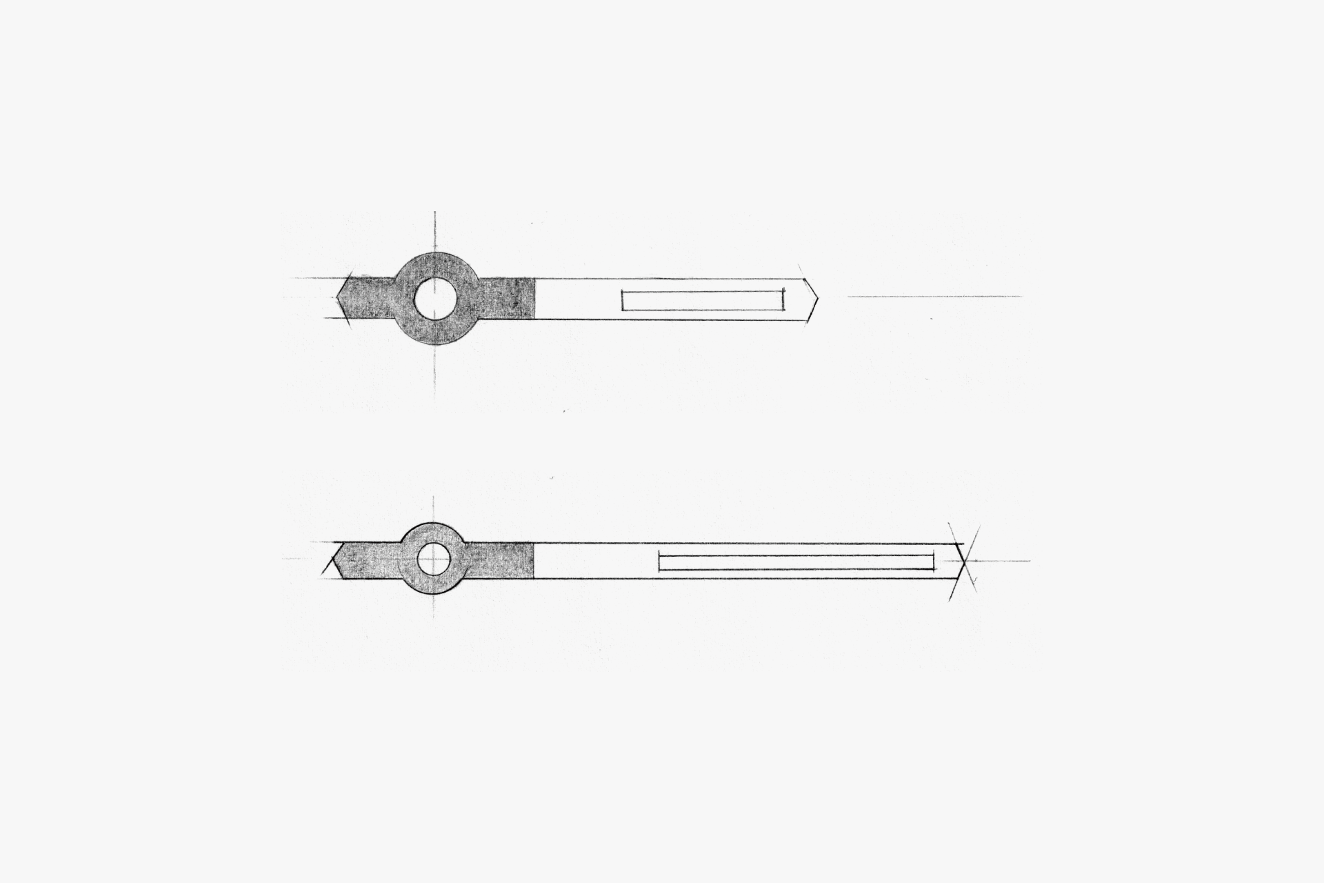
Both the hour and minute hands have a simple, standard shape, with white tips for high visibility.
MARKETER'S EYE
Simple or UNsimple?
This model takes “SIMPLE” as its keyword and revisits the essence of a watch—reading the time—developing an original typeface as a crucial element.
What is noteworthy is the dial rendered solely in black and white. There are two versions of this model: the one on display here with a black dial and white type, and another with a white dial and black type.
When black text is placed on white and white text is placed on black, the same design can become harder to read due to visual illusions. Therefore, while preserving the same “SIMPLE” impression on both black and white dials, we repeatedly made meticulous adjustments to stroke weight, length, font size, and layout.
In terms of ingenuity, it may, in fact, be a watch that is not “SIMPLE.”